When you think of old things, what comes to mind? Cars, oil paintings, that pair of comfy jeans calling your name, or that smoky bourbon sitting in your pantry? Now, how about old brands? Brands like Speedo, Nikon, UPS, Boeing, Target, J.M. Smucker Company, Coca-Cola, and General Electric are all brands that have achieved centenarian status (over 100 years old) – and so has Nabisco.
Nabisco’s roots can be traced back to nine east coast bakeries that had merged by late 1889. By 1890, 40 midwestern bakeries were added to the family and their new moniker was New York Biscuit Company. In 1898, there was a massive merger engineered by Adolphus Green that included New York Biscuit Company and from that merger, National Biscuit Company (known colloquially as NBC) was born.
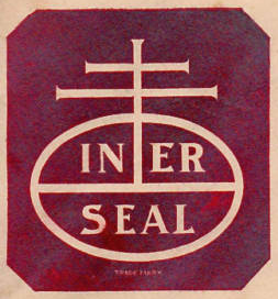
 This leads us to the ancestral Nabisco logo. Mr. Green began earnestly looking for a symbol that would be the brand for a product new to the market and innovative in its package design: Uneeda Biscuit. While thumbing through his rare book collection, he came across a colophon – a printer’s mark – from a society of printers in 15th century Venice, Italy. A red octagonal form, inspired by the Uneeda Biscuit shape, then backed the mark and “In-Er-Seal” was added to impress upon the consumer the new wax paper packaging method that maintained the crispness of the biscuits.
Why is it Called Nabisco?
In 1901, the Nabisco name was introduced as a new cookie, “Nabisco Sugar Wafers.” The name Nabisco was derived from the first two letters of its parent company’s name, National Biscuit Company. It seems fitting that Nabisco’s birth year was celebrated with a sweet treat. By 1918, the acronym NBC replaced the word “In-Er-Seal” on the logo. The National Biscuit Company adopted Nabisco as the family name by which to identify the company and its many products in 1941. It is then that “Nabisco” replaced “NBC” in the oval shape of the logo; however, it is interesting to note that NBC did not formally become Nabisco until much later. During the 1940s, NBC became so fully represented by the Nabisco brand that NBC itself became like the parent companies of today, silent and ghost-like (mostly no one realizes that 10, just 10, companies control the entire food industry today).

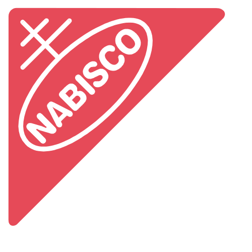
The red triangle that is Nabisco, as we now know it, first appeared in 1952. By this time, Nabisco had grown so large that it was, in essence, a parent brand and was in desperate need of a unifying element across all of its products. Designed by Raymond Loewy & Associates, the 1952 brand mark retained a variation of the colophon to maintain the Nabisco connection with consumers and the addition of a red triangle to attract their attention. This unifying symbol became the brand identifier on all Nabisco packaging. Eighteen years later, on April 27, 1971, the National Biscuit Company officially began operating as Nabisco. While this was a big change internally, it was not such a big news item to the consumers. Only a slight change was made to the logo to commemorate Nabisco’s promotion: a white border now surrounded the red triangle.
In 2012, Nabisco became part of the Mondelez International product line. Bernhart Fudyma Design Group (BFDG) was contacted to modernize the refined 1958 version of the Nabisco logo with the aim to “increase legibility, improve reproduction accuracy, and convey a more contemporary and friendlier look.” Today’s new brand mark was design by BFDG and rendered by typographic master Gerard Huerta.

Source: What’s your deal
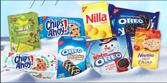
So, what is your favorite Nabisco product? Oreo? Wheat Thins? Fig Newtons? Nilla Wafers? Something elsle? Comment below! Thanks for reading Why is Nabisco Called Nabisco!
Chloie Parsons is the Chief Creative Mind at C2C Designs. When she is not merrily building brands, you can find her painting, illustrating, kayaking the lakes, or at the river fly-fishing.”


[…] Company. Comprised of more than 40 bakeries, this merger would last a lifetime, ultimately becoming Nabisco in […]